")


Graphics


Media

Publishing
Our Story
B&B comunicare was founded in 1972 with great enthusiasm by Fiorenzo Ballabio who, captured by the harmony of the colours and the “paper sensibility”, after five years study and working his way up invented a new way of working.
A “complete service” was born: a customer does not need to control the different printing phases: a graphic designer for the ideas, a photographer for the pictures, a photo lithography for the plates and a printery: only one person to rely on, thus avoiding all responsibility and sparing time and money. In thirty years the working way of this enterprise has been succesfull thanks to customers’ satisfaction who could test the professional competence of this firm and of its owner reaching satisfactory results for both sides.
Now this heritage has changed its owner, comunicarte is born, a natural changeover from a father to his son to go on believing in the future and wishing that young entrepreneurs can run the firm better than before.
Andrea Ballabio relying on your preference, wishes to be spurred to a continuous undertaking in order to garantee that kind of service that characterized the history of B&B comunicare.
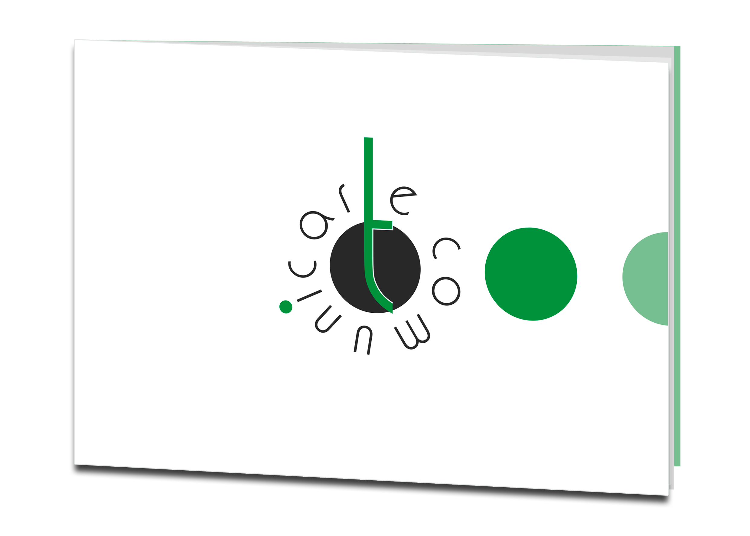
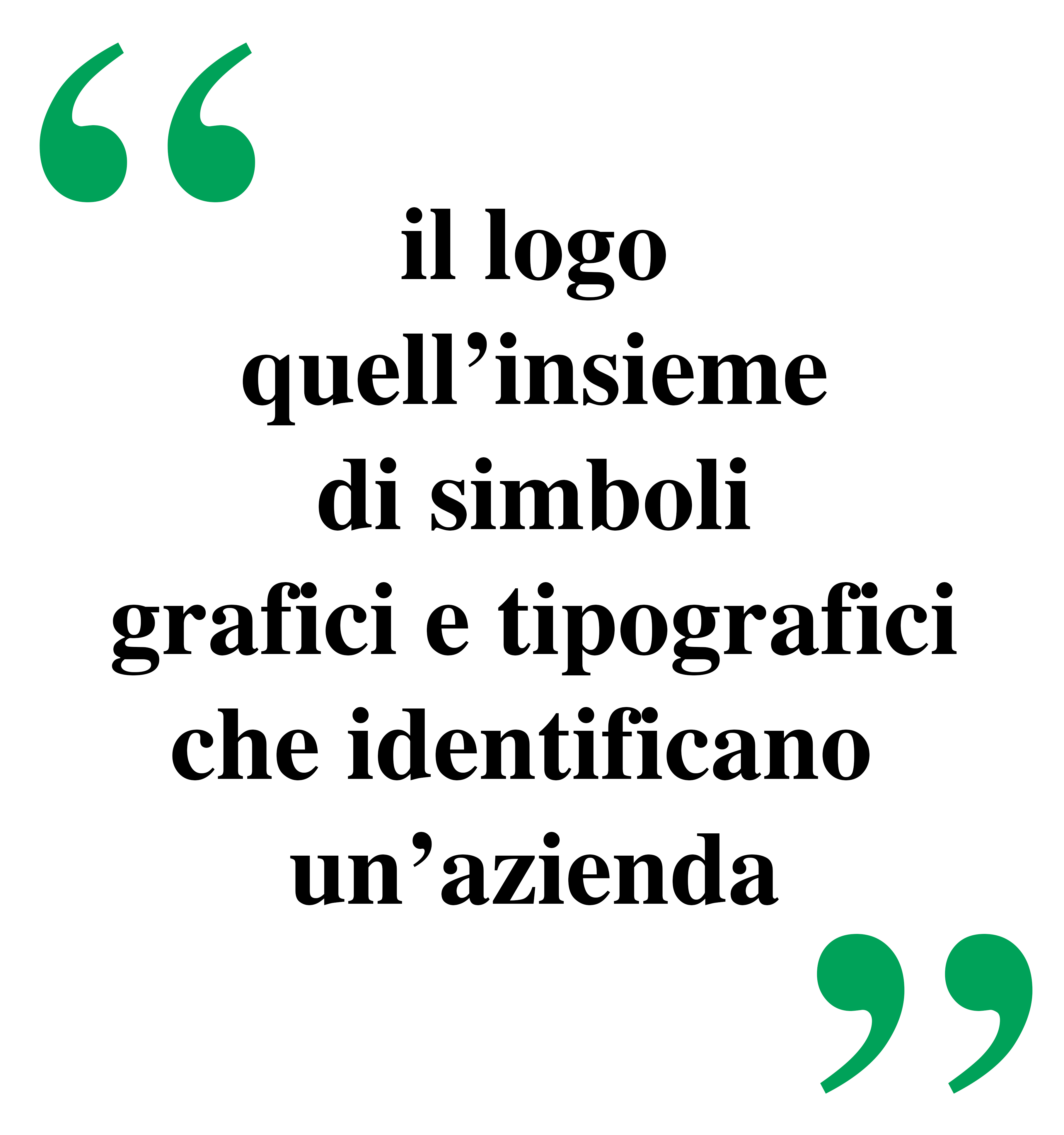
The brand
A name that differs from the usual, which avoids banality and decides to come up with coherent and pertinent messages: via inflated suffixes that often affirm the unlikely and welcome to creative naming with its simple names and ready to comply with established patents.
A name that shows some refinement, an in-depth study of product consistency, positioning and brand that works very well.
It is a novelty that proposes an unparalleled neologism and a wealth of positive associations.
Emerging on the market also means knowing how to distinguish in a visual and verbal way, trying to create recognizable and memorable uniqueness.
The brand plays with linearity, expressing purity, freshness and simplicity while the lowercase character is slim and light. The peculiarity of the logo lies in the point with the "t": stretched upwards communicates dynamism, energy, cheerfulness and a pinch of fantasy.
Typography
The lettering with its simplicity combines in a balanced manner with the most sophisticated design of the brand: it does not ignore the iconographic part, completing the composition with harmony.
Reading clockwise expresses the will to build over time.
Iconography
Perfect geometry along with the round sign send stability and solidity and communicate warmth, creativity and genuineness.
Colours
Green and black are strong contrast colors and generate good visibility.
Black expresses the symbolic part in the production of printed matter, but also the seriousness and reliability; Synonymous with tradition and elegance is a neutral color that fits in with harmony and is fundamental to give strength and character
To the brand.
Green is an archetype of nature, in this shade of light symbolizes
The spring and the splendor that characterizes it, the rebirth and the growth.
Phonetics
The melody is fascinating, strange, profound.
A particularly firm phonetics characterizes this brand by the way
Of a strong presence of the R sound that evokes strength, fluidity and enthusiasm.
Communicate: Communicate art cards, the art of communicating with paper and more.
Our big family of comunicarte
Andrea Ballabio


Janeth Wickramarachchi
Passionate about photography and drawing started to study at Communications School of Tradate Don Milani until he comes into contact with comunicarte.
At that time Janeth decided to join the work world to learn directly on the field all the graphic and editorial notions that the company has developed in its long history.
By maintaining an in-depth attention to all that is taught, Janeth demonstrates a great creativity that he develops with the technological means that are made available to form well-structured and highly communicative graphic works.
Sachin Wickramarachchi
New Entry...


One to One Image
Thanks to their experiences they are aware not only of a simple service offer but also of the importance of active collaboration with their customers. This collaboration allows the creation of excellent products concerning their quality and reliability based on correctness, pragmatism and competence in order to achieve the best results within the terms prescribed.
For comunicarte this studio takes care of the photographical and artistic side of publishing works and technical catalogues through photos realized in the studio or outside.
Aldo Nessi
He is better known as “il lentino” because of his working accuracy. In every work he puts a great enthusiasm for printing, a field that is continuously evolving and requires updating. His bright ideas about the machinary choice and the selection of employees have reached great success in quality and inexpensiveness.
Aldo works in close contact with Andrea, the manager of comunicarte and responsible for graphic department. Together they bild a pair that is the live axis of this firm.

Ernesto Miragoli
After passing schoolleaving examination at high grammar school “A. Volta” in Como, he studied theology and graduated with a thesis about “Law and Morals”.
Still young he started a collaboration with some local and national newspapers (L’Ordine, La Provincia, Rivista Como, Il “Settimanale di Como” Italia Oggi, Il Giornale) and he wrote interesting texts for Cultural Centres about literature, history, art and cinema.
After getting a master of communication Science, he worked in 1980 as freelance journalist.
He supervised some programmes for local TV ad attended as a guest national and international broadcasting.
He is managing director of the magazine “Caparol Attualità” and editor of B&B edizioni, publishing firm in Mozzate.
In comunicarte he is responsible for the editing of newsletters and creates texts for advertising campaigns and graphic projects of catalogues and firm monographs.